The reason that I chose to create an Ident for E4 is because it is a live brief and E4 have an E-sting competition in which I intend to enter my animation/s
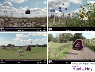
Whilst looking at the previous E4 Ident enteries I found the E4 website usefull as you can see the ratings for the animations given by the auidence. This gave me a good idea of what to include and not include in my E4 Ident. These are a small number of intesesting Idents for E4 but personally I feel that all of them are lacking in some way. This first E4 Ident shows a journey of the E4 logo as it floats above a farm land, ok it is artistic but I feel that this Ident lacks in imagination, we want to sho that E4 is lively, interesting and fun to watch, I feel that this animation does not show this, instead of having the E4 logo floating above the land, it could have interacted with the live action and maybe having a little charater to the logo itself. Whilst doing this project I found that having a theme is so important, having a theme gives you a direction in which to go with your project and a starting point. To me this Ident doesn't really have a theme, it is a typical spring/sumers day, with flowers, fields and animals, the only difference is that there are E4's logo floating above them. I want to get a reaction from the audience with my animations because if they react to it the audience will remember it.
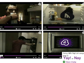
This is an E4 Ident that I have seen on television, the rating on this one is 50 percent, so the audience like this one more than the previous Ident and I can see why; this Ident has a theme - "comedy". It has imagination and although it is a little silly it has a lively and funny appraoch, the lively music also enhances the Ident and will atract them to the E4 channel. This animation has been nger population to this made to fit with the target audience, the typical slob who lives in his flat opens his fridge to find an E4 monster eating his food and to rub this in he burps as the guy opens it. I think that this I dent is unpredictable and is what the audience want, something that will suprise them, I have used this in my animation having the story change direction, at first my rooster is big and bold but suddenly he becomes fragile and not so big and bold. In this Idents case the story changes from normality to a bizzar piece, I think that the audience like that contrast and it is this that gives them a reaction. In this case the reaction that the Ident is trying to get is laughter, I think that it does achieve this but not as much as we want, perhaps this normal world isn't quite what the audience want as we find out on the next E4 Ident.
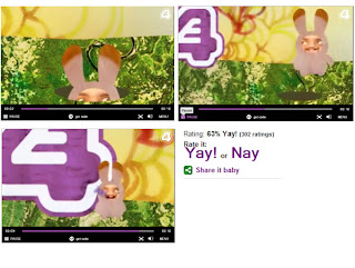
Now this is a bizar Ident for E4, but has quite a good rating from the audience, to me this Ident lacks a little in quality, but at the same time it suits the style of animation. The animating is not very good at all, it has little movement only the rabbit that jumps to the E4 logo and begins to lick it. I think that it is the story that the audience have based the ratings on and the bouncy style, it's a quick lively animation that is straight to the point which is what E4 want. This Ident is quite eye catching as it has use of bright colours, I have used this approach in one of my Idents, having the sky being the E4 purple and the orange sun to compliment the purple. I have tried to stick to a limited colour palette as I didn't want too much distractions going on in my animations.
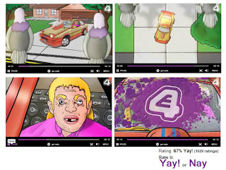
Again the rating has got a little higher so this gives me a good idea of what people want to see in an E4 Ident. This animation has a more straight forward storyboard, beginning with a group of pigeons sitting on telephone cables above a house, then having eye to eye contact with a guy in a sports car, knowing how much this guy must love his car; the pigeons decide to do their business on his front window. This Ident is a little supprising and I gather that the audience also like the odd sillyness and also the idea of revenge or spite even. I personally feel that this Ident would look better in 3D as it looks a little flat, or even some collage of materials to give it that added depth. This would give it a more unique style and quality to it. So looking at the highest rated Idents for E4 I have found that the most popular Idents are lively, humourus, un-predictable, have use of characters and mainly animals. In my animation I have used all of these, in terms of making a good Ident to promote the channel E4 and show off it's qualities, I have chosen the theme comedy, by using the theme comedy I came up with a lively storyboard using a rooster and hens. The story of my Idents are un-predictable and I hope to achieve a good response from the audience.
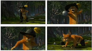
This is another example of a contrast within a character, at first the charcter (puss in boots) appears to be confident, aggresive and bold, but then in the same scene he begins to choke and shrinks to the ground; now being fragile and the complete opposite of a confident character. I have used this approach in my Ident where my main character changes in appearance, at first he is confident, bold and masculine, but then chokes as he begins his main role in the animation and the story and character changes to humourus; the rooster then becomes fragile and again the opposite of confident. Puss in boots appears aggresive at first but as we get to know his character we find that he is actually quite gentle; my rooster at first will appear a "lady's man" but then we soon find that he is clumsy but with an innosence about him as he doesn't mean to do wrong but always managed to fail and messes things up. The body posture is important of the character as it is this and the face expressions that give the characters their personality. To show the confidence of Puss in boots, his body posture is up right as he makes himself look as big as he can. In my Ident I have exaggerated on the size of his chest, having him top heavy to look bold and masculine, when he begins to choke his body structure changes; his body and tail bend to the ground.

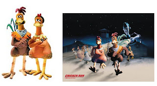
For the form and texture of my characters I have looked at chicken run, this is a popular animation loved by an audience of all ages. It is also unisex so fits perfectly with in my target audience for E4. Although this is a stop motion animation; this is a great reference for me as I can use this when I sculpt my maquette of my models and also when I come to modelling in Maya. The problem that I had when I was designing my rooster was that I wanted his wings to have the use of hands, at first I began looking at the way they have made their arms and my roosters arms were too human like, in Chicken run the characters are built with the axis of a human and there for their human like feature's fit with the style but with my rooster I have designed him looking more like a rooster but with the character of a human. I used more wing like arms, having it so his fingers are more like feathers but with the use of fingers. As well as inspiration from the charcters, I also used a simular form for my hens huts, I have used a "cartoon" style of texture having the wood looking soft, whereas in Chicken run the textures are more realistic.


